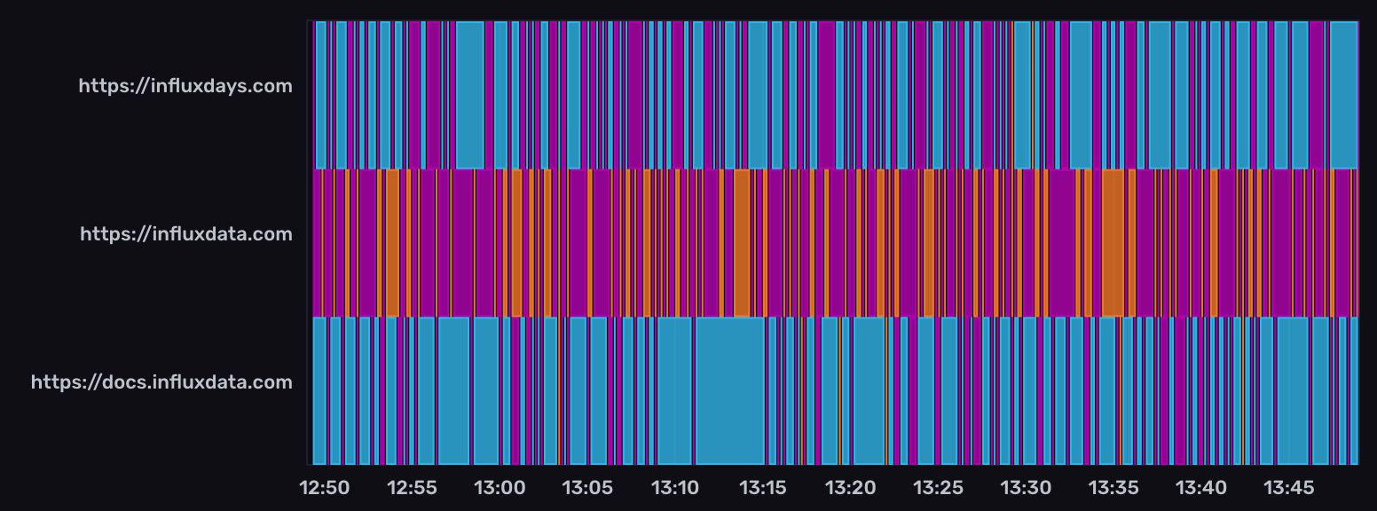
Mosaic visualization
This page documents an earlier version of InfluxDB OSS. InfluxDB 3 Core is the latest stable version.
The Mosaic visualization displays state changes in your time series data. This visualization type is useful when you want to show changes in string-based states over time.

Select the Mosaic option from the visualization dropdown in the upper left.
Mosaic behavior
The mosaic visualization displays colored tiles based on string values in a specified column. Each unique string value is represented by a different color.
Mosaic controls
To view Mosaic controls, click Customize next to the visualization dropdown.
Data
- Fill Column: Select a column to fill in the mosaic tiles.
- X Column: Select a column to display on the x-axis.
- Y Column: Select one or more columns to display on the y-axis.
- Time Format: Select the time format. Options include:
- YYYY-MM-DD HH:mm:ss ZZ
- YYYY-MM-DD hh:mm:ss a ZZ
- DD/MM/YYYY HH:mm:ss.sss
- DD/MM/YYYY hh:mm:ss.sss a
- MM/DD/YYYY HH:mm:ss.sss
- MM/DD/YYYY hh:mm:ss.sss a
- YYYY/MM/DD HH:mm:ss
- YYYY/MM/DD hh:mm:ss a
- HH:mm
- hh:mm a
- HH:mm:ss
- hh:mm:ss a
- HH:mm:ss ZZ
- hh:mm:ss a ZZ
- HH:mm:ss.sss
- hh:mm:ss.sss a
- MMMM D, YYYY HH:mm:ss
- MMMM D, YYYY hh:mm:ss a
- dddd, MMMM D, YYYY HH:mm:ss
- dddd, MMMM D, YYYY hh:mm:ss a
Options
- Color Scheme: Select a color scheme to use for your graph.
X Axis
- X Axis Label: Enter a label for the x-axis.
- Generate X-Axis Tick Marks: Select the method to generate x-axis tick marks:
- Auto: Select to automatically generate tick marks.
- Custom: To customize the number of x-axis tick marks, select this option, and then enter the following:
- Total Tick Marks: Enter the total number of timestamp ticks to display.
- Start Tick Marks At: Enter the time, in RFC3339 format, to start displaying ticks. Use the Date Picker field to automatically generate an RFC3339 formatted timestamp for this field.
- Tick Mark Interval: Enter the number of milliseconds in between each timestamp tick.
Y Axis
- Y Axis Label: Enter a label for the y-axis.
- Y Label Separator: If there’s more than one column on the y-axis, enter a delimiter to separate the label, such as a comma or space. If there’s no separator specified, the labels are a continuous string of all y columns.
- Generate Y-Axis Tick Marks: Select the method to generate y-axis tick marks:
- Auto: Select to automatically generate tick marks.
- Custom: To customize the number of y-axis tick marks, select this option, and then enter the following:
- Total Tick Marks: Enter the total number of ticks to display.
- Start Tick Marks At: Enter the value to start ticks at.
- Tick Mark Interval: Enter the interval in between each tick.
Hover Legend
- Orientation: Select the orientation of the legend that appears upon hover:
- Horizontal: Select to display the legend horizontally.
- Vertical: Select to display the legend vertically.
- Opacity: Adjust the legend opacity using the slider.
- Colorize Rows: Select to display legend rows in colors.
Example query
The following query uses the NOAA water sample data
to display changes in water levels over time.
Use level description as the Fill Column in the visualization controls.
from(bucket: "noaa")
    |> range(start: v.timeRangeStart, stop: v.timeRangeStop)
    |> filter(fn: (r) => r._measurement == "h2o_feet")
    |> filter(fn: (r) => r._field == "level description")
    |> aggregateWindow(every: v.windowPeriod, fn: last, createEmpty: false)
Was this page helpful?
Thank you for your feedback!
Support and feedback
Thank you for being part of our community! We welcome and encourage your feedback and bug reports for InfluxDB and this documentation. To find support, use the following resources:
Customers with an annual or support contract can contact InfluxData Support.
