
Heatmap visualization
This page documents an earlier version of InfluxDB OSS. InfluxDB 3 Core is the latest stable version.
API token hashing is enabled by default in InfluxDB OSS 2.9.0
Stronger token security: tokens are stored as hashes on disk, so a copy of the database file doesn’t expose usable tokens. Existing tokens are hashed on first startup and the original strings can’t be recovered afterward — capture any plaintext tokens you still need before you upgrade.
For more information, see Token hashing.
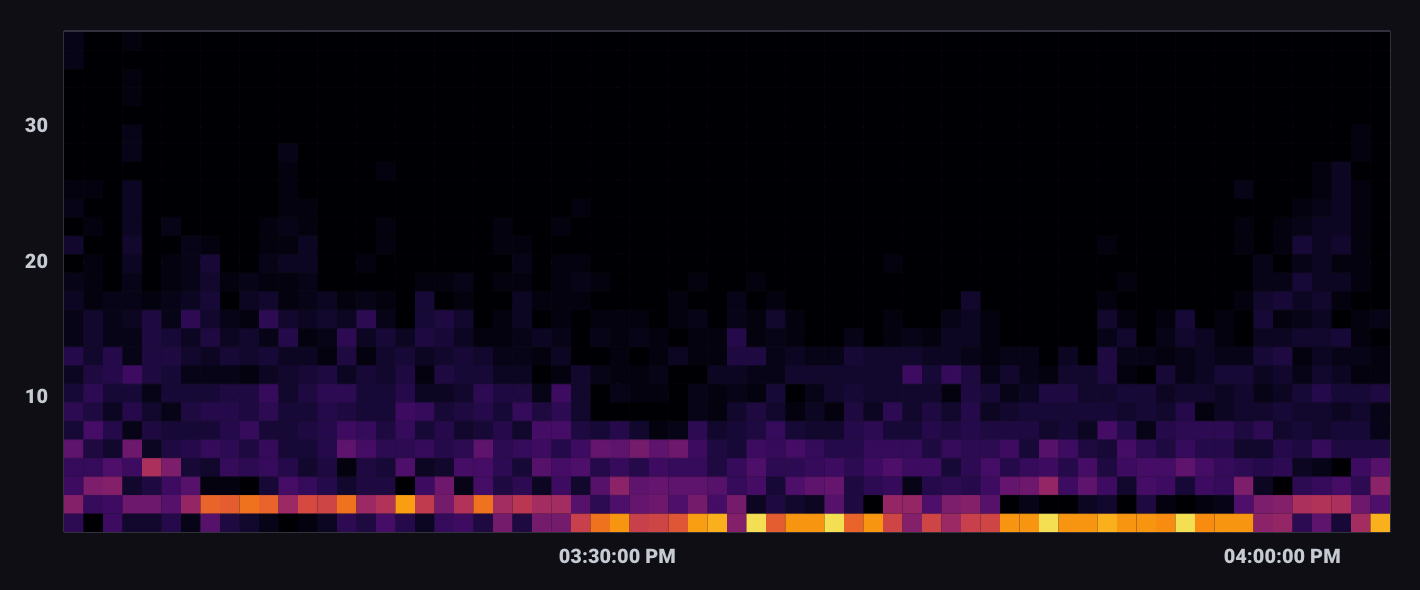
A Heatmap displays the distribution of data on an x and y axes where color represents different concentrations of data points.
Select the Heatmap option from the visualization dropdown in the upper left.
Heatmap behavior
Heatmaps divide data points into “bins” – segments of the visualization with upper and lower bounds for both X and Y axes. The Bin Size option determines the bounds for each bin. The total number of points that fall within a bin determine the its value and color. Warmer or brighter colors represent higher bin values or density of points within the bin.
Heatmap Controls
To view Heatmap controls, click Customize next to the visualization dropdown.
Data
- X Column: Select a column to display on the x-axis.
- Y Column: Select a column to display on the y-axis.
- Time Format: Select the time format. Options include:
- YYYY-MM-DD HH:mm:ss ZZ
- YYYY-MM-DD hh:mm:ss a ZZ
- DD/MM/YYYY HH:mm:ss.sss
- DD/MM/YYYY hh:mm:ss.sss a
- MM/DD/YYYY HH:mm:ss.sss
- MM/DD/YYYY hh:mm:ss.sss a
- YYYY/MM/DD HH:mm:ss
- YYYY/MM/DD hh:mm:ss a
- HH:mm
- hh:mm a
- HH:mm:ss
- hh:mm:ss a
- HH:mm:ss ZZ
- hh:mm:ss a ZZ
- HH:mm:ss.sss
- hh:mm:ss.sss a
- MMMM D, YYYY HH:mm:ss
- MMMM D, YYYY hh:mm:ss a
- dddd, MMMM D, YYYY HH:mm:ss
- dddd, MMMM D, YYYY hh:mm:ss a
Options
- Color Scheme: Select a color scheme to use for your heatmap.
- Bin Size: Specify the size of each bin. Default is 10.
X Axis
- X Axis Label: Label for the x-axis.
- Generate X-Axis Tick Marks: Select the method to generate x-axis tick marks:
- Auto: Select to automatically generate tick marks.
- Custom: To customize the number of x-axis tick marks, select this option, and then enter the following:
- Total Tick Marks: Enter the total number of ticks to display.
- Start Tick Marks At: Enter the value to start ticks at.
- Tick Mark Interval: Enter the interval in between each tick.
- X Axis Domain: The x-axis value range.
- Auto: Automatically determine the value range based on values in the data set.
- Custom: Manually specify the minimum y-axis value, maximum y-axis value, or range by including both.
- Min: Minimum x-axis value.
- Max: Maximum x-axis value.
Y Axis
- Y Axis Label: Label for the y-axis.
- Y Tick Prefix: Prefix to be added to y-value.
- Y Tick Suffix: Suffix to be added to y-value.
- Generate Y-Axis Tick Marks: Select the method to generate y-axis tick marks:
- Auto: Select to automatically generate tick marks.
- Custom: To customize the number of y-axis tick marks, select this option, and then enter the following:
- Total Tick Marks: Enter the total number of ticks to display.
- Start Tick Marks At: Enter the value to start ticks at.
- Tick Mark Interval: Enter the interval in between each tick.
- Y Axis Domain: The y-axis value range.
- Auto: Automatically determine the value range based on values in the data set.
- Custom: Manually specify the minimum y-axis value, maximum y-axis value, or range by including both.
- Min: Minimum y-axis value.
- Max: Maximum y-axis value.
Hover Legend
- Orientation: Select the orientation of the legend that appears upon hover:
- Horizontal: Select to display the legend horizontally.
- Vertical: Select to display the legend vertically.
- Opacity: Adjust the legend opacity using the slider.
- Colorize Rows: Select to display legend rows in colors.
Heatmap examples
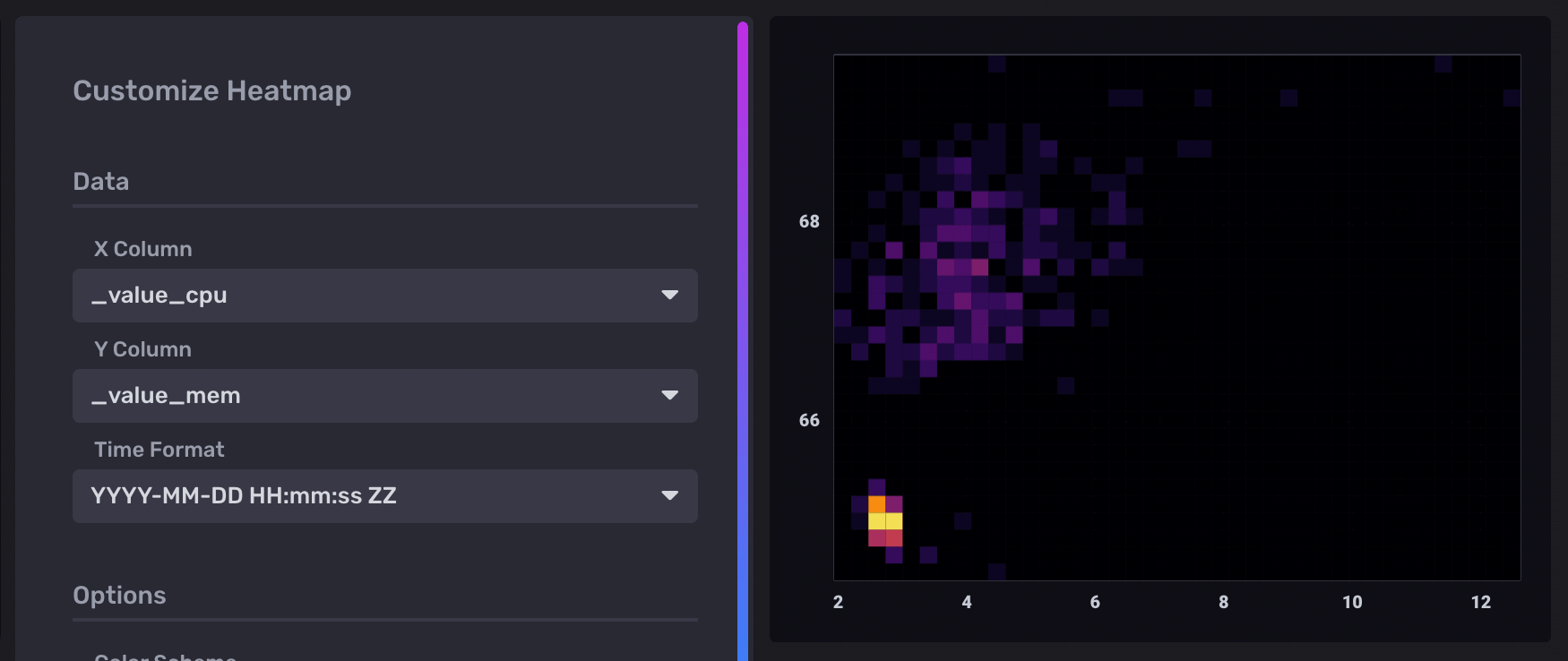
Cross-measurement correlation
The following example explores possible correlation between CPU and Memory usage. It uses data collected with the Telegraf Mem and CPU input plugins.
Join CPU and memory usage
The following query joins CPU and memory usage on _time.
Each row in the output table contains _value_cpu and _value_mem columns.
cpu = from(bucket: "example-bucket")
    |> range(start: v.timeRangeStart, stop: v.timeRangeStop)
    |> filter(fn: (r) => r._measurement == "cpu" and r._field == "usage_system" and r.cpu == "cpu-total")

mem = from(bucket: "example-bucket")
    |> range(start: v.timeRangeStart, stop: v.timeRangeStop)
    |> filter(fn: (r) => r._measurement == "mem" and r._field == "used_percent")

join(tables: {cpu: cpu, mem: mem}, on: ["_time"], method: "inner")
Use a heatmap to visualize correlation
In the Heatmap visualization controls, _value_cpu is selected as the X Column
and _value_mem is selected as the Y Column.
The domain for each axis is also customized to account for the scale difference
between column values.
Important notes
Differences between a heatmap and a scatter plot
Heatmaps and Scatter plots both visualize the distribution of data points on X and Y axes. However, in certain cases, heatmaps provide better visibility into point density.
For example, the dashboard cells below visualize the same query results:

The heatmap indicates isolated high point density, which isn’t visible in the scatter plot. In the scatter plot visualization, points that share the same X and Y coordinates appear as a single point.
Was this page helpful?
Thank you for your feedback!
Support and feedback
Thank you for being part of our community! We welcome and encourage your feedback and bug reports for InfluxDB OSS v2 and this documentation. To find support, use the following resources:
Customers with an annual or support contract can contact InfluxData Support.