Visualization types in Chronograf
Chronograf’s dashboard views support the following visualization types, which can be selected in the Visualization Type selection view of the Data Explorer.
Each of the available visualization types and available user controls are described below.
For information on adding and displaying annotations in graph views, see Adding annotations to Chronograf views.
Line Graph
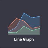
The Line Graph view displays a time series in a line graph.
Line Graph Controls
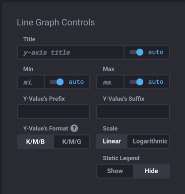
Use the Line Graph Controls to specify the following:
- Title: y-axis title. Enter title, if using a custom title.
- auto: Enable or disable auto-setting.
- Min: Minimum y-axis value.
- auto: Enable or disable auto-setting.
- Max: Maximum y-axis value.
- auto: Enable or disable auto-setting.
- Y-Value’s Prefix: Prefix to be added to y-value.
- Y-Value’s Suffix: Suffix to be added to y-value.
- Y-Value’s Format: Toggle between K/M/B (Thousand/Million/Billion) and K/M/G (Kilo/Mega/Giga).
- Scale: Toggle between Linear and Logarithmic.
- Static Legend: Toggle between Show and Hide.
Line Graph example

Stacked Graph
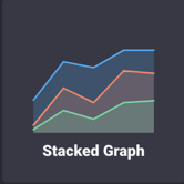
The Stacked Graph view displays multiple time series bars as segments stacked on top of each other.
Stacked Graph Controls
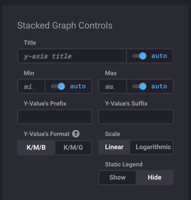
Use the Stacked Graph Controls to specify the following:
- Title: y-axis title. Enter title, if using a custom title.
- auto: Enable or disable auto-setting.
- Min: Minimum y-axis value.
- auto: Enable or disable auto-setting.
- Max: Maximum y-axis value.
- auto: Enable or disable auto-setting.
- Y-Value’s Prefix: Prefix to be added to y-value.
- Y-Value’s Suffix: Suffix to be added to y-value.
- Y-Value’s Format: Toggle between K/M/B (Thousand/Million/Billion) and K/M/G (Kilo/Mega/Giga).
- Scale: Toggle between Linear and Logarithmic.
- Static Legend: Toggle between Show and Hide.
Stacked Graph example

Step-Plot Graph
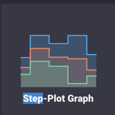
The Step-Plot Graph view displays a time series in a staircase graph.
Step-Plot Graph Controls
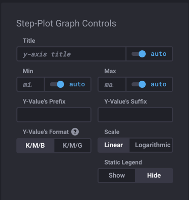
Use the Step-Plot Graph Controls to specify the following:
- Title: y-axis title. Enter title, if using a custom title.
- auto: Enable or disable auto-setting.
- Min: Minimum y-axis value.
- auto: Enable or disable auto-setting.
- Max: Maximum y-axis value.
- auto: Enable or disable auto-setting.
- Y-Value’s Prefix: Prefix to be added to y-value.
- Y-Value’s Suffix: Suffix to be added to y-value.
- Y-Value’s Format: Toggle between K/M/B (Thousand/Million/Billion) and K/M/G (Kilo/Mega/Giga).
- Scale: Toggle between Linear and Logarithmic.
Step-Plot Graph example

Bar Graph
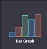
The Bar Graph view displays the specified time series using a bar chart.
To select this view, click the Bar Graph selector icon.
Bar Graph Controls
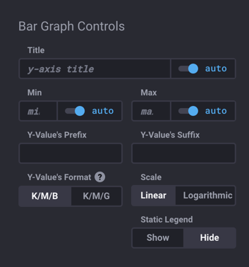
Use the Bar Graph Controls to specify the following:
- Title: y-axis title. Enter title, if using a custom title.
- auto: Enable or disable auto-setting.
- Min: Minimum y-axis value.
- auto: Enable or disable auto-setting.
- Max: Maximum y-axis value.
- auto: Enable or disable auto-setting.
- Y-Value’s Prefix: Prefix to be added to y-value.
- Y-Value’s Suffix: Suffix to be added to y-value.
- Y-Value’s Format: Toggle between K/M/B (Thousand/Million/Billion) and K/M/G (Kilo/Mega/Giga).
- Scale: Toggle between Linear and Logarithmic.
Bar Graph example

Line Graph + Single Stat
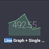
The Line Graph + Single Stat view displays the specified time series in a line graph and overlays the single most recent value as a large numeric value.
To select this view, click the Line Graph + Single Stat view option.
Line Graph + Single Stat Controls
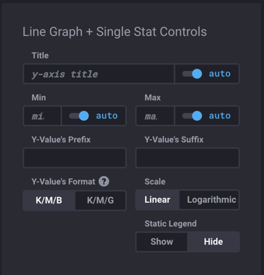
Use the Line Graph + Single Stat Controls to specify the following:
- Title: y-axis title. Enter title, if using a custom title.
- auto: Enable or disable auto-setting.
- Min: Minimum y-axis value.
- auto: Enable or disable auto-setting.
- Max: Maximum y-axis value.
- auto: Enable or disable auto-setting.
- Y-Value’s Prefix: Prefix to be added to y-value.
- Y-Value’s Suffix: Suffix to be added to y-value.
- Y-Value’s Format: Toggle between K/M/B (Thousand/Million/Billion) and K/M/G (Kilo/Mega/Giga).
- Scale: Toggle between Linear and Logarithmic.
Line Graph + Single Stat example

Single Stat
The Single Stat view displays the most recent value of the specified time series as a numerical value.
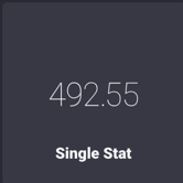
If a cell’s query includes a GROUP BY tag clause, Chronograf sorts the different series lexicographically and shows the most recent field value associated with the first series.
For example, if a query groups by the name tag key and name has two tag values (chronelda and chronz), Chronograf shows the most recent field value associated with the chronelda series.
If a cell’s query includes more than one field key in the SELECT clause, Chronograf returns the most recent field value associated with the first field key in the SELECT clause.
For example, if a query’s SELECT clause is SELECT "chronogiraffe","chronelda", Chronograf shows the most recent field value associated with the chronogiraffe field key.
Single Stat Controls
Use the Single Stat Controls panel to specify one or more thresholds:
- Add Threshold: Button to add a new threshold.
- Base Color: Select a base, or background, color from the selection list.
- Color options: Ruby, Fire, Curacao, Tiger, Pineapple, Thunder, Honeydew, Rainforest, Viridian, Ocean, Pool, Laser (default), Planet, Star, Comet, Pepper, Graphite, White, and Castle.
- Prefix: Prefix. For example,
%,MPH, etc. - Suffix: Suffix. For example,
%,MPH, etc. - Threshold Coloring: Toggle between Background and Text
Gauge
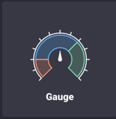
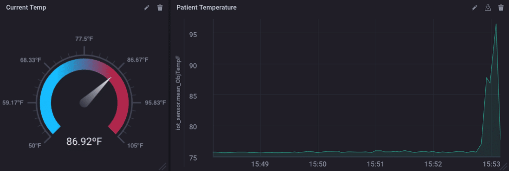
The Gauge view displays the single value most recent value for a time series in a gauge view.
To select this view, click the Gauge selector icon.
Gauge Controls
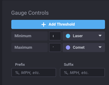
Use the Gauge Controls to specify the following:
- Add Threshold: Click button to add a threshold.
- Min: Minimum value for the threshold.
- Select color to display. Selection list options include: Laser (default), Ruby, Fire, Curacao, Tiger, Pineapple, Thunder, and Honeydew.
- Max: Maximum value for the threshold.
- Select color to display. Selection list options include: Laser (default), Ruby, Fire, Curacao, Tiger, Pineapple, Thunder, and Honeydew.
- Prefix: Prefix. For example,
%,MPH, etc. - Suffix: Suffix. For example,
%,MPH, etc.
Gauge example
Table
The Table panel displays the results of queries in a tabular view, which is sometimes easier to analyze than graph views of data.
Table Controls
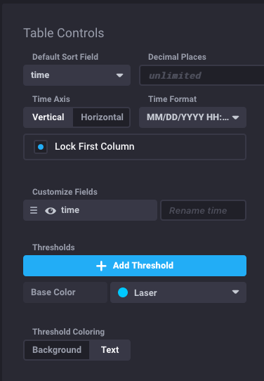
Use the Table Controls to specify the following:
Default Sort Field: Select the default sort field. Default is time.
Decimal Places: Enter the number of decimal places. Default (empty field) is unlimited.
Time Axis: Select Vertical or Horizontal.
Time Format: Select the time format.
- Options include:
MM/DD/YYYY HH:mm:ss(default),MM/DD/YYYY HH:mm:ss.SSS,YYYY-MM-DD HH:mm:ss,HH:mm:ss,HH:mm:ss.SSS,MMMM D, YYYY HH:mm:ss,dddd, MMMM D, YYYY HH:mm:ss, orCustom.
- Options include:
Lock First Column: Lock the first column so that the listings are always visible. Threshold settings do not apply in the first column when locked.
Customize Field:
- time: Enter a new name to rename.
- [additional]: Enter name for each additional column.
- Change the order of the column by dragging to the desired position.
Thresholds
Note: Threshold settings apply to any cells with values, except when they appear in the first column and Lock First Column is enabled.
- Add Threshold (button): Click to add a threshold.
- Base Color: Select a base, or background, color from the selection list.
- Color options: Ruby, Fire, Curacao, Tiger, Pineapple, Thunder, Honeydew, Rainforest, Viridian, Ocean, Pool, Laser (default), Planet, Star, Comet, Pepper, Graphite, White, and Castle.
Table view example

Note
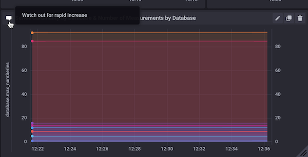
The Note panel displays Markdown-formatted text with your graph.
Note Controls
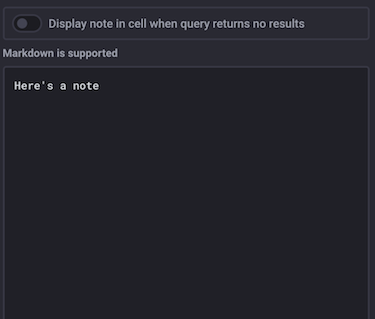
Enter your text in the Add a Note panel, using Markdown to format the text.
Enable the Display note in cell when query returns no results option to display the note text in the cell instead of No Results.
Note view example
Was this page helpful?
Thank you for your feedback!
Support and feedback
Thank you for being part of our community! We welcome and encourage your feedback and bug reports for Chronograf and this documentation. To find support, use the following resources:
